What do you call it when your front door is so inviting, your welcome mat starts to feel a little left out?
Knob envy.
(We’ll see ourselves out.)
Really, though: When it comes to making a you-belong-here statement, few elements deliver the message quite like a home’s front door. After all, it single-handedly serves as your abode’s unofficial welcome committee, greeting guests well before your open arms have a chance to usher them across the threshold.
And it does it all with just a simple coat or two of paint — provided you choose the right color.
Whether you’re making payments on an 18th-century farmhouse or a contemporary ranch, the tips below will help you choose the just-right hue to declare your house your happy place with a statement front door.
Scope the overall exterior
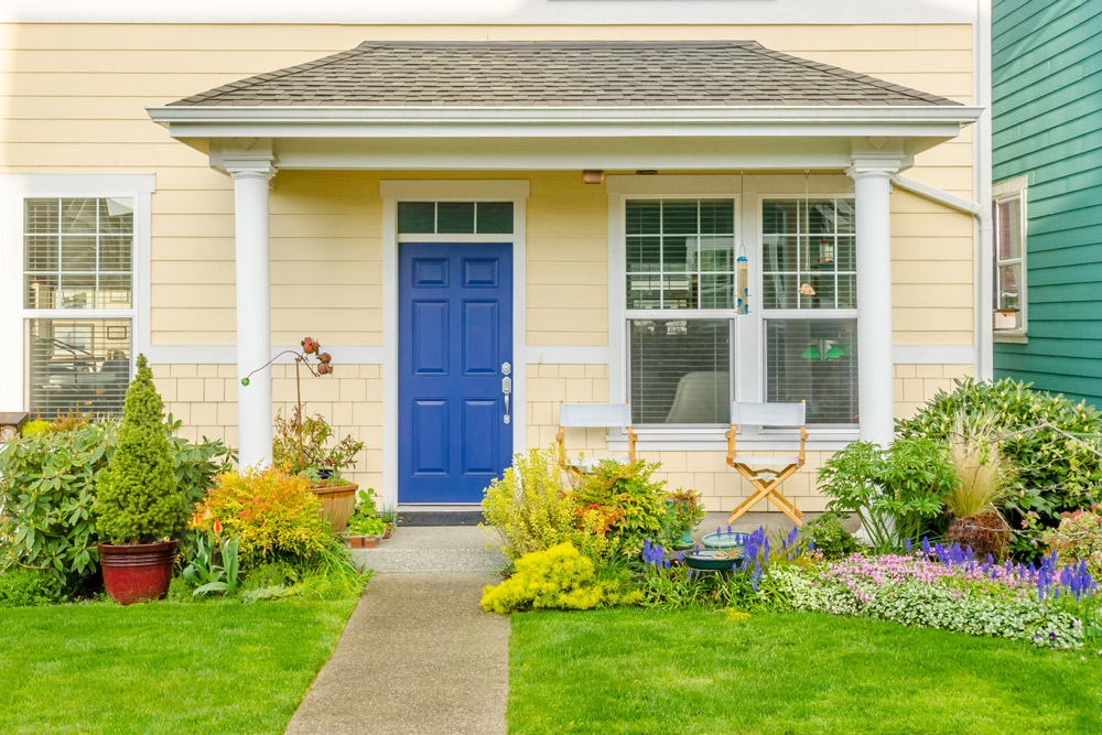
Before you even peek at a paint swatch, you need to take a good, hard look at your home’s exterior. Head outside and make note of the existing paint scheme and roof color, as well as any architectural details such as shutters, siding, trim, flashing — even your landscaping.
Because let’s face it: That magenta hue would probably look out of place on your red brick Colonial, no matter how many times you favorite the color on Pinterest. Be sure to snap a few pics for reference later.
Evaluate similar styles
Overwhelmed by choices? Narrow down your selection by researching color schemes that are historically accurate — or just well-suited — to your home’s architectural style. Victorians can accommodate candy colors, for instance, while craftsman-style homes are traditionally painted in earthy, complementary hues.
And what are your neighbors doing? Decide if you’d rather blend in or stand out — or just ignore all of the above and go with whatever makes you happy.
Pick your palette
If the warm fuzzies are your endgame, then you can’t go wrong with yellow. Greens and blues are said to be calming, whereas oranges and reds are known to be energetic and vibrant. Of course, this all depends on the tint (amount of white) or shade (amount of black) of your chosen color. Jewel tones will emit more drama than muted pastels; a deep red sends a different message than cotton candy pink.
Learn how to use the color wheel
Remember learning about the color wheel in grade school? It’s time to take a refresher course, especially if you’ll be coordinating your door with your home’s existing paint colors.
Here’s a quick rundown of the color schemes most commonly applied in home decor:
Complementary colors are those directly across from each other on the color wheel (e.g., red and green); their contrast promises the most impact when paired together.
Analogous color schemes rely on sets of three or more colors that sit directly next to each other on the color wheel; think yellow, yellow-green, and green.
Triadic color schemes involve three colors that are evenly spaced on the wheel; picture an equilateral triangle pointing to three different colors, like purple, green, and orange.
Monochromatic color schemes make use of a single color and gain visual interest by using variations in its tint, shade, and tone.
Make a swatch board
What you see isn’t always what you get, so bring plenty of swatches home from the paint store.
Here’s a handy trick: Tape the swatches to a piece of white foam core, then place the board somewhere near your door. That way, you can get a true sense of how the color will appear as the light changes throughout the day.
Keep the weather and the changing seasons in mind too. Try to envision how the paint color would appear on a cloudy, snowy day, as well as those filled with sunshine and ample foliage.
Break out of your comfort zone
The sun will knock the intensity of any color down a notch, so don’t be afraid to experiment with a shade that’s a little bit outside your comfort zone. It is just paint, after all!
Still not convinced? Go with a front door in red or black, the two colors said to jibe with the broadest range of architectural styles. Reds with blue undertones, such as cranberry, are a tried-and-true favorite.
Accessorize
Commanding attention from the curb should be a team effort. Consider accessorizing your freshly painted door with shiny new hardware. Copper or brass handlesets and kickplates, for example, would pop against a door painted a deep shade of violet or indigo. Complete the look by flanking your door with planters, rolling out a cheeky welcome mat, installing new house numbers, or any combo of the above.
Bring the outside in
Fall in love with your front door’s new hue? Invite it inside by painting the other side of your door the same color. Just remember: Each side may require a different paint finish, particularly if they show differentiating signs of wear. For instance, while a high-gloss finish makes a color appear more vivid, it’s also known to highlight imperfections.
What are your favorite colors for a statement front door? Share your suggestions in the comments below.