
- For the first time since Q3 2016, the number of U.S. homes for sale did not decline year-over-year in Q1. Although the inventory of premium homes fell 4.5%, the inventory of starter and trade-up homes rose 3.5% and 4.8%, respectively, compared to a year ago.
- All the pricey West Coast markets saw inventory grow across starter, trade-up and premium homes from the previous year. San Jose, Calif., led the way, with 55.4% more listings. However, the rise in inventory appears to be due to an exhaustion of demand in those markets, resulting in fewer shoppers buying what’s available, and homes sitting on the market longer.
For the first time in more than two years, the number of U.S. homes available for sale did not decline year-over-year in the first quarter, instead staying flat from a year ago thanks to strong (and, to date, very rare) inventory gains in the starter and trade-up price categories.
Inventory was flat in Q1 2019 compared with the same quarter in 2018 and did not decline for the first time since Q3 2016. Inventory grew year-over-year in exactly half of the nation’s 100 largest metro areas, up from just 19 one year ago. And while the supply of the most expensive, premium homes fell 4.5% year-over-year, starter and trade-up inventory actually grew. Starter-home inventory rose 3.5% year-over-year – the fastest annual growth rate observed in more than 6 years.
The growing number of lower-priced homes on the market may be construed as welcome news for many first-time home buyers entering the market this spring. But a closer look at local inventory trends reveals that the markets with the greatest growth in inventory are also markets where prices have rapidly risen to notoriously high levels and supply has been severely constrained over the past few years. This rapid appreciation has caused affordability to deteriorate more quickly in these areas, and the nascent rise in inventory may actually reflect an exhaustion of demand in these communities, more than it reflects a greater number of sellers listing their homes.
In Many Places, New Listings Aren’t Driving Inventory Growth
By some traditional measures, the number of homes available for sale is actually on the rise in many expensive, supply-constrained metros. But in some cases, inventory growth seems to be driven more by ebbing demand rather than an infusion of new supply. The number of homes newly listed nationwide – which would count as additional supply by those traditional measures – was down 6.9% year-over-year in Q1 (from 293,481 newly listed homes in Q1 2018 to 273,282 homes in Q1 2019).
If the number of homes newly listed for sale is falling, but the number of homes actually on the market is flat or rising, that means listed homes are lingering on the market longer, carrying over from month-to-month and inflating inventory counts (and potentially misleading people into thinking more homes are coming online). We see this reflected in longer listing times – nationwide, the median number of days a home stayed on market was up 1.5% year-over-year in Q1 from 80 days to 82 days. It’s also worth noting that this is a conservative measure of the lengthening days on market since this relies on homes that have already been through the entire listing and transaction process, likely understating degree to which current listings are and will be on the market longer than if they had been listed earlier.
| 2019 Q1 National Inventory and Price Watch | ||||||||
| 2019 Q1 | Change, 2018 Q1 – 2019 Q1 | |||||||
| Housing Segment | Median List Price | Share of Total | Inventory | % of Income Needed to Buy Median Priced Home in Segment | % Change in Median List Price | Percentage Point Change in Share | % Change Inventory | Additional Share of Income Needed to Buy Home (Percentage Point Change) |
| Starter | $139,900 | 24% | 305,981 | 37.7% | 12.4% | 0.8% | 3.5% | 3.7% |
| Trade-Up | $249,000 | 31% | 395,980 | 24.6% | 8.3% | 1.4% | 4.8% | 1.6% |
| Premium | $464,900 | 46% | 589,817 | 20.7% | 5.7% | -2.2% | -4.5% | 0.9% |
It’s also useful to examine which kinds of homes are making up the bulk of available inventory. Of all homes available for sale, more than half (54.3%) are priced in the starter- or trade-up-home segments, and inventory has been growing faster (or at least, falling less quickly) in these two segments for four straight quarters. The trend marks a reversal of more than four straight years in which the highest-valued, premium-tier homes made up an increasingly large portion of the market.
Despite gains in these less-expensive tiers, affordability concerns will persist this spring as starter and trade-up home prices continue to march upward, growing 12.4% and 8.3%, respectively, over the past year. People shopping for homes in these categories can now expect to pay 37.7% and 24.6% of their income on a monthly mortgage payment, respectively – up 3.7 percentage points and 1.6 percentage points from a year ago. A common rule of thumb is that housing costs should not exceed 30% of household income.
More Inventory Doesn’t Mean Better Affordability
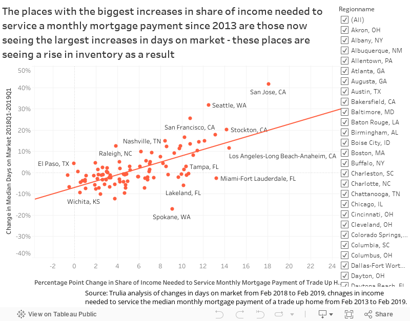
The 10 markets with the largest gains in inventory are also among the nation’s most-expensive housing markets, including the San Francisco Bay Area, Seattle, Los Angeles and San Diego. But even in these markets, dramatic increases in inventory – especially among starter homes – have yet to stem the tide of declining affordability.
|
Top 10 Metros with the Highest Total Inventory Growth |
|||||
| U.S. Metro | Total For-Sale Inventory, YoY % Growth, (Q1 2018 – Q1 2019) |
Starter Home Inventory, YoY % Growth, (Q1 2018 – Q1 2019) | Median Listing Price of Starter Home (2019) | Median Home Income of Starter Home Buyer (2019) | Share of Income Needed to Afford Starter Home, YoY Percentage Point Change (2019) |
| San Jose, CA | 55.4% | 78.3% | $759,000 | $44,163 | 96.5% (+6.5%) |
| Provo, UT | 53.3% | 154.3% | $259,450 | $32,076 | 45.5% (+6.5%) |
| Seattle, WA | 40.6% | 14.4% | $309,000 | $34,468 | 53.6% (+4.4%) |
| Salt Lake City, UT | 37.3% | 70.1% | $260,000 | $29,937 | 50.1% (+5.3%) |
| Ogden, UT | 31.7% | 33.4% | $209,900 | $35,818 | 33.8% (+6.1%) |
| Colorado Springs, CO | 30.4% | 18.6% | $212,168 | $29,937 | 41.2% (+4.9%) |
| Stockton, CA | 29.3% | 74.8% | $244,995 | $24,559 | 60.4% (+5.5%) |
| Los Angeles, CA | 28.5% | 37.8% | $419,990 | $26,390 | 90.6% (+3.3%) |
| San Francisco, CA | 28.2% | 37.7% | $529,900 | $36,407 | 82.8% (+3.7%) |
| San Diego, CA | 25.8% | 21.7% | $399,999 | $30,160 | 76.2% (+1.0%) |
Of the markets seeing the biggest year-over-year increases in inventory, only San Diego experienced a slower rate of deterioration in starter-home affordability than the national rate. But even a modest 1 percentage point increase in the share of income needed to afford a starter home does not negate the fact that entry-level buyers in America’s Finest City still need to spend 76.2% of their income to afford a typical starter home (assuming a 20% down payment and 30-year fixed rate loan). Realistically, potential buyers earning an income in the bottom-third of all San Diego-area incomes cannot afford to buy the typical, local entry-level home.
In fact, based on the 30% rule of thumb, none of the markets where inventory rose the most are considered “affordable.” In San Jose, Calif., and Provo, Utah, entry-level home buyers should expect to spend 96.5% and 45.5% of their income, respectively, on their monthly mortgage payment, up 6.5 percentage points from a year ago.
Not All Inventory Growth is Created Equal
On average, inventory rises when more new listings come online and also when homes stay on the market for longer. Looking at newly added inventory and metro-level days on market, we found that for every 1% increase in the number of days from listing to sale from a year ago, a metro could be expected to experience inventory growth that is 0.9 percentage points higher than in the previous year, absent any changes to the amount of newly-listed homes. Similarly, a place that has seen the number of newly-listed homes rise 1% from the previous year is expected to experience inventory growth that is 1.1 percentage points higher than the year prior, absent any changes to the median days on market.
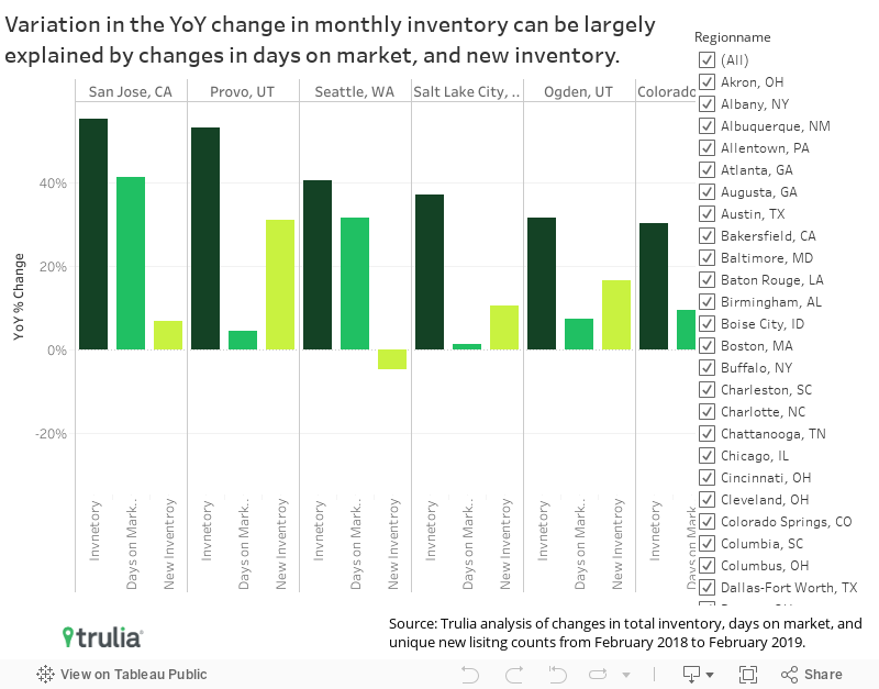
But days on market and flow of new inventory coming on the market don’t always move in the same direction, and the contrast can reveal how supply and demand forces are playing out differently from one region to another. Provo, Utah and Seattle, experienced the second- and third-largest gains in inventory, growing 53.3% and 40.6% year-over-year in Q1 2019, respectively. But the underlying trends in each market are very different.
In Provo, inventory growth is largely driven by a recent influx of new listings. The median number of days between listing and sale rose just 4.4% from Q1 2018 to Q1 2019, from 57 days to 60 days. Over the same time, the number of newly listed homes for sale increased 31.3%, to 635 from 484 homes. So while homes in Provo are taking roughly just as long to sell, the sheer number of homes that are popping up on the market relative to last year is pushing up inventory. This general trend typically holds in markets where affordability has eroded less than the national average, including Atlanta, Grand Rapids, Mich., and San Antonio.
In contrast, Seattle has seen the number of newly listed homes fall 4.8% from a year ago, but this drop has been more than offset by a 31.6% increase in days on market. Homes in Seattle are now selling in a median of 69.5 days, compared with 52.8 days a year ago. Similar trends are observed in Dallas, Portland, Ore., and San Jose, Calif. In areas where affordability has eroded more than the national average since 2013, a seeming decrease in demand by would-be buyers creates the appearance of a sudden abundance of inventory. Inventory appears to be growing in these markets, but buyers should know that it’s happening because homes are lingering on the market longer than they were in years past.
Conclusion
Nationally, more starter and trade-up homes to choose from is certainly welcome news, especially for budget-conscious first-time home buyers. And trade-up buyers selling one home and buying another will also appreciate having more options when they make their next home purchase. But as home values continue to rise and affordability suffers, many of the markets experiencing the biggest increases in inventory are more likely just becoming cost-prohibitive to more buyers. For these would-be buyers, simply having more options is probably not enough to change the affordability math.
Methodology
Note: We have switched from using metropolitan statistical areas and metropolitan divisions where available to strictly using core based metropolitan statistical areas (CBSA).
Examples of definitions affected by this change include the following:
- What we used to refer to separately as San Francisco-Redwood City-South San Francisco, CA and Oakland-Hayward-Berkeley, CA is now just the San Francisco-Oakland-Hayward, CA metro.
- What we used to refer to separately as Dallas-Plano-Irving, TX and Fort Worth-Arlington, TX is now just the Dallas-Fort Worth-Arlington, TX metro.
Each quarter Trulia’s Inventory and Price Watch provides three metrics: (1) the number and share of inventory that are starter homes, trade-up homes, and premium homes, (2) the change in share and number of these homes, and (3) the affordability of those homes for each type of buyer. For our inventory metrics, we count the number of unique listings in each price tier throughout the course of a month.
Additionally, this quarter, we also looked at the median days on market and the 3-month rolling average of newly listed properties by starter, trade-up, and premium home price tiers.
We define the price cutoffs of each segment based on home value estimates of the entire housing stock, not listing price. For example, we estimate the value of each single-family home and condo and divide these estimates into three groups: the lower third we classify as starter homes, the middle third as trade-up homes, and the upper third as premium homes. We classify a listing as a starter home on the market if its listing price falls below the price cutoff between starter and trade-up homes. This is a subtle but important difference between our inventory report price points and others. This is because the mix of homes on the market can change over time and can cause large swings in the price points used to define each segment. For example, if premium homes comprise a relatively large share of homes for sale, it can make the lower third of listings look like they’ve become more expensive when in fact prices in the lower third of the housing stock are unchanged.
Price is based on the median listing price of every active for-sale listing throughout the month. We measure affordability as the share of income needed to purchase the median-priced home, assuming a 20% down payment and the average 30-year fixed mortgage rate in each quarter as quoted by Freddie Mac in the Primary Mortgage Market Survey (PMMS). Household incomes are calculated using 1-Year American Community Survey (ACS) microdata. We adjust the 2016 income data to the current period using the Employment Cost Index. We divide incomes into terciles and take the median in each tercile to create three income levels corresponding to the three tiers of listing prices. The affordability of starter homes is calculated using the bottom-third of incomes, trade-up is calculated using the middle-third, and premium is calculated using the top-third.
To determine the degree to which days on market and newly listed inventory impacts monthly unique inventory counts, we regressed unique inventory counts on these two variables at the metro level to come up with the following results:
| Table 1. Relationship between YoY inventory changes at the metro-level and days on market and newly listed homes (100 largest metros) | |||
|
|
|||
| YoY Percent Change in Inventory |
|||
| (1) | (2) | (3) | |
| % Change in Days on Market YoY | 1.165*** | 0.905*** | |
| (0.141) | (0.080) | ||
| % Change in 3-Month Rolling Average of Newly Listed Homes YoY | 1.282*** | 1.101*** | |
| (0.109) | (0.073) | ||
| Constant | 0.008 | 0.103*** | 0.079*** |
| (0.013) | (0.013) | (0.009) | |
| Observations | 100 | 100 | 100 |
| R2 | 0.410 | 0.587 | 0.823 |
| Notes: *p<0.1; **p<0.05; ***p<0.01 | |||